Top 10 election design guidelines
-
Use lowercase letters
Lowercase letters are more legible than ALL CAPITAL LETTERS because they are easier to recognize. -
Avoid centered type
Left-aligned type is more legible than centered type, which forces the eye to stop reading in order to find the start of the next line. -
Use big enough type
“Fine print” is hard to read and may intimidate or alienate voters. Use minimum type sizes: 12-point for optical scan; 25-point for touchscreens. (Following this principle for optical scan ballots may impact printing costs but will be a worthwhile investment in election accuracy.) -
Pick one sans-serif font
Avoid introducing new fonts, which require the eye to stop reading and adjust. Sans-serif fonts with clean strokes (Arial, Helvetica, Univers, Verdana) are recommended for screen and for the quantity and variation of text found on paper ballots. For dual-language materials, use bold text for the primary language, regular text for the secondary language. -
Support process and navigation
For optical-scan ballots, offer comprehensive instructions and page numbering. For touchscreen ballots, offer language and mode options, continuous access to instructions, consistent and flexible navigation and clear feedback about selections. Post notable wayfinding and instructional materials in and around the polling place. -
Use clear, simple language
State instructions and options as simply as possible. Summarize referenda in simple language alongside required formats. Do not include more than two languages on any one material. -
Use accurate instructional illustrations
Visual instructions help low-literacy and general-population voters. Photo images, which are difficult to shoot and reproduce well, are not recommended. Illustrations must be accurate in their details to avoid misleading voters. -
Use informational icons (only)
Avoid political party icons. Icons that call attention to key information and support navigation are recommended in limited use. -
Use contrast and color functionally
Use color and shading consistently: on optical scan ballots, to differentiate instructions from contents and contests from each other; and on touchscreen ballots, to support navigation, call special attention and provide user feedback. Color cannot be relied on as the only way to communicate important information. -
Decide what's most important
Page and screen layout and text sizes should support information hierarchy. For instance, the ballot title should be more prominent than any one contest, a contest header should be more prominent than its candidates' names and a candidate's name should be bolder than his/her party affiliation. Candidates' names and options should be presented with equal importance.
Ballot and polling place design
-
Report of Findings: Use of Language in Ballot Instructions (NIST)
-
Better Ballots (Brennan Center for Justice)
-
Field Guide to Ensuring Voter Intent Vol. 1 Designing usable ballots (Center for Civic Design)
-
Field Guide to Ensuring Voter Intent Vol. 2 Writing Instructions voters understand (Center for Civic Design)
-
Field Guide to Ensuring Voter Intent Vol. 3 Testing ballots for usability (Center for Civic Design)
-
Ballot Building (Chapter 5 of EAC Election Management Guidelines)
-
Design Counts in Election (EAC Roundtable Discussion)
-
Presentations on Effective Ballot Design and Polling Place Signage (EAC Public Meeting)
-
Testimonies and Presentations on Ballot Design (EAC Public Meeting)
EAC provides the following best practices report and samples for the design of ballots and polling place materials. Legislative guidelines, design principals and research with election officials, voters, poll workers, and other experts inform these resources. The design of election materials is complex; therefore, we recommend that samples for optical scan ballots, direct-recording electronic (DRE) ballots and polling place voter information materials be viewed in the context of the full report, which addresses the design planning process, general best practices, implementation insights, limitations and more.
Effective Designs for the Administration of Federal Elections Report
-
Download the full report Effective Designs for the Administration of Federal Elections including content on all research events, design best practices and examples or view by section. Published June 2007.
-
Introduction -- Overview of the report and research methods; advises how to use report.
-
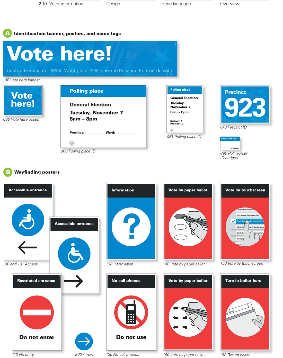
Voter Information Materials -- Summarizes best practices; provides planning resources for the design of polling place materials, including ballot content; provides sample design specifications for polling place signage in one and two languages.
-
Optical Scan Ballots -- Summarizes best practices; offers planning guidance; provides design guidelines covering the four basic content areas of ballot design (election info, ballot instructions, ballot navigation and questions); sample design specifications are for ballots in one and two languages.
-
Full-face DRE Ballots -- Summarizes best practices; offers planning guidance; provides design guidelines covering the four basic content areas of ballot design (election info, ballot instructions, ballot navigation and questions).
-
Rolling DRE Ballots -- Summarizes best practices; offers planning guidance; describes the sequence of ballot screens and interactions required to deliver content and support tasks in the voting process (select language, vote, review, and cast); offers example screens.
-
Research Report: Nebraska Test Pilot -- Results from the real-election application of draft optical scan ballot and polling place material designs; findings span the productions process to the Election Day experience.
-
Research Report: Nine Research Events -- Summarizes the research events comprising the user-centered process that resulted in best practice recommendations that are grounded in legislative, budgetary, technical and voter realities.
Sample Polling Place Signage
Information and instructions, binder pages and tabletop formats


